Gotham: Not Just the Obama Font
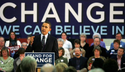
A significant portion of my visitors come from searches for Obama’s font, so I might as well give the people what they want. Obama uses a very strong typeface for most of his signage, most notably promoting “change we can believe in.” Pity about the dangling preposition.
It’s called Gotham.

Gotham’s designer, Tobias Frere-Jones, has long collected typography specimens from around New York City. The bold, majestic faces leftover from over half a century of announcing places and things have a nostalgic charm that hadn’t been dusted off until Gotham made its debut in 2000.
Back when graphic designers were less common (the whole profession probably sounded pretty wishy-washy in the ’40s), the architects and engineers who constructed a building often ended up designing its signage.
As a result Gotham is a geometric font, but Frere-Jones allowed it to “escape the grid wherever necessary, giving the design an affability usually missing from ‘geometric’ faces,” according to the H&FJ website. Frere-Jones often cites the lettering above the Port Authority Bus Terminal as inspiration.
Gotham is wider than average text, lending it gravity and solidity. It says, “What I’m saying is special enough to warrant the extra room I require.” Increased legibility comes from this and the large x-height (the height of the lower part of the letter, usually compared to the ascender).

You might be surprised to hear it arose from a commission for GQ Magazine. It’s been used by pretty much everyone before the Obama campaign got their hands on it.
A few days ago I saw a foreign model surprised that Barack Obama uses the same font that advertises an underwear brand back home. I even used the ultra caps for the logo of my file-delivery service, Sendshack.
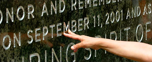
You can also see it on the cornerstone of the Freedom Tower being built where the World Trade Center once stood. Quite the honor for a typeface designed to reflect the spirit of New York City.

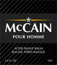
H&FJ also point out that McCain’s using a font most would recognize from the supermarket cosmetic aisle.

Where have you noticed Gotham?